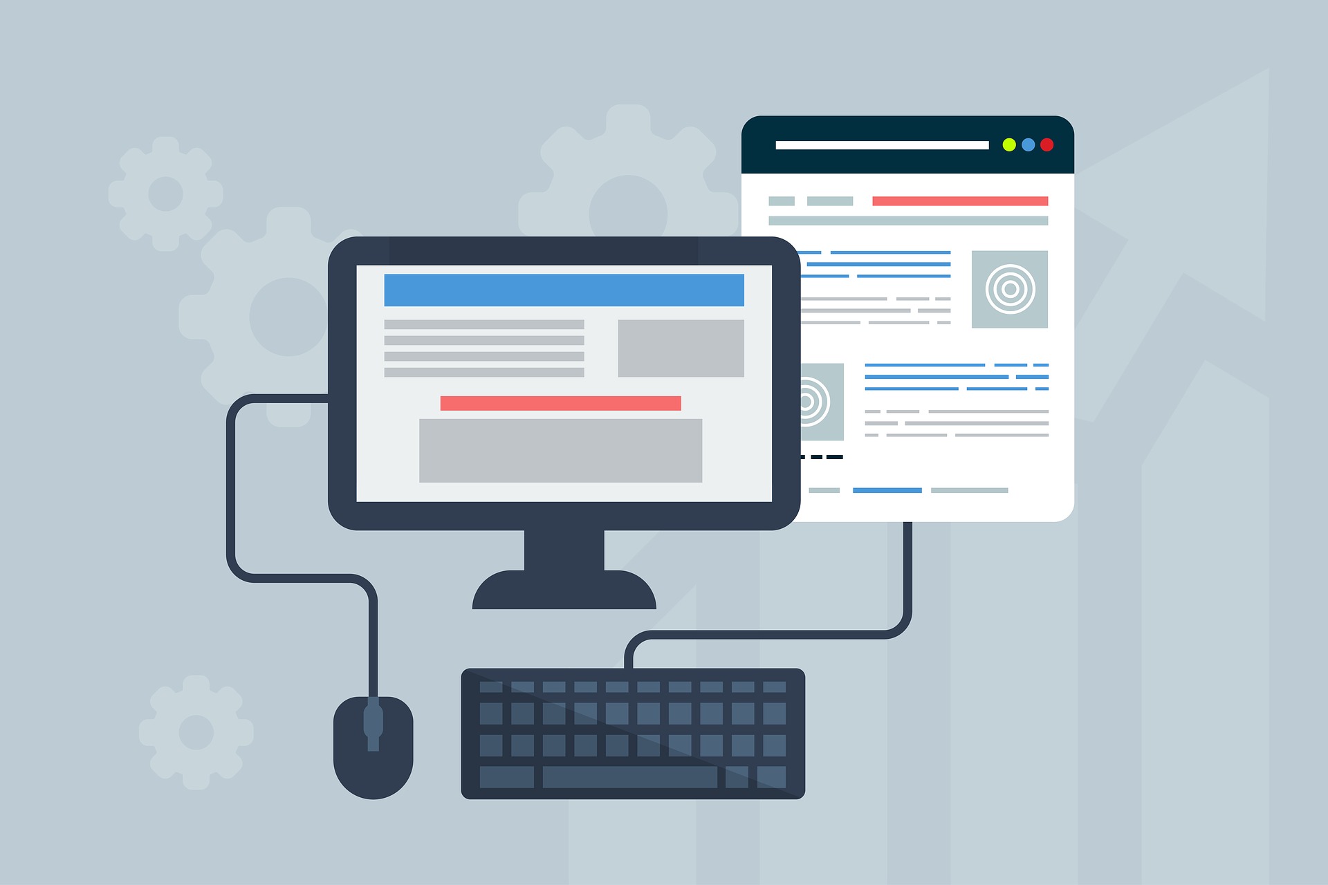
How To Make A Mobile Friendly Website
August 22, 2022 | Sarah Clark
Table of Contents
Do you know the exact point of time when mobile internet usage surpassed desktop internet usage? The year was 2016 when this major revolution happened. Smartphones went from being a luxury or an object of fascination to one of absolute necessity.
Why did this change occur? For multiple reasons of course. But social media sites did have an enormous contribution in this regard. People wanted to be on social media at all moments, so clearly their phone was the only possible way they could quench this thirst for continuous internet access.
It’s almost impossible to go through daily life without a phone now. Everything from Googling the directions to your favorite morning coffee place to getting a cab requires mobile internet access. So, what does that mean for your website?
As any Dallas digital marketing agency will tell you, it’s high time you optimize your website for mobile usage. That is if you haven’t already. There’s no need to panic and start making
abrupt changes to your site. First, you need to find out if your website is optimized for mobile usage already.
Is Your Website Mobile Friendly?
If your website has been designed in the past 2-3 years, there’s no way it’s not already mobile-friendly. This is because all website developers focus equally on the desktop and the mobile versions of the website now. The easiest way to check if your website is mobile-friendly is by simply visiting the site through your mobile and seeing if you can easily access it.
However, if you want a detailed review, you should check out Mobile-Friendly Test – Google Search Console. This Google tool is completely free and checks your website in no time. Not just that, it provides you with a mobile view of your website as other people can see it.
If your website passes this test with flying colors, no need to go on reading further. However, even if your website is optimized for the mobile phone, there is often room for improvement. So, if you plan on contacting a separate digital marketing agency in Dallas for this, you can just keep reading instead.
How To Make Your Website Mobile Friendly?
Make a Responsive Website
The first step to making a website mobile-friendly is by having a responsive website. You might have seen how the information on a desktop website immediately reorganizes itself when you open it from your mobile. This is the primary function of a responsive website- to make sure all the important bits of information are still visible without following the original desktop layout.
You might think website responsiveness is a difficult goal to achieve, but it is supremely easy as Google provides tools for it. Your SERP rankings demand a responsive website. It is an essential step toward Search Engine Optimization.
Know What People Are Looking For
No matter how responsive your mobile website is though, it is simply not a good idea to supply the visitor with a ton of information on a way smaller screen. You need to prioritize what will be visible.
So, how do you decide what is the most important piece of information on your landing page? Simple, just head over to Google Analytics and specify Mobile Traffic in the Behavior Section. There are various other ways to figure out what your visitors are mainly searching for. For example, heatmaps can help in this regard because they provide a cumulative view of the customer behavior of thousands of visitors at once.
Wherever visitors are lingering the most, is the bit of information that you need to place front and center on your mobile website.
Get Rid of Pop-Ups
Pop-ups are annoying enough on desktop websites. Any Dallas digital marketing company will vouch for the fact that mobile websites cannot afford to have pop-ups.
Since the screen is much smaller, it’s way more difficult for the visitors to locate the “x” button to get rid of the pop-up. You might think this is working in your favor, but you couldn’t be more wrong. The failure to close pop-ups doesn’t encourage the visitor to read the pop-up and follow its instructions. It encourages them to hightail it out of the website to search for another.
If you think having pop-ups is necessary, make sure you opt for exit pop-ups. That way, at least, you won’t be losing visitors midway.
Avoid Clutter
As I have mentioned before already, only keep the important bits of information on the main screen. However, this is easier said than done. After all, desktop sites are filled with attractive graphics and sale options, and CTAs. How do you downsize this to such an extreme degree?
The trick is to shove all the immediately unnecessary bits to the bottom. Whatever you don’t need to show immediately should be compartmentalized into the hamburger menu at the top or on the sides.
Decrease Page Loading Time
People are way more impatient on their phones than they are on their desktops. This is because it’s inconvenient to switch tabs on mobile and go off to do something else while the page is loading.
There are plenty of ways to decrease your page loading time. But before you start doing any of these, you need to know the current state of your page loading time. For this, simply head over to Pagespeed Insights. All you need to do is enter your website URL and you’re going to get a detailed report on how well your page is performing speed-wise. If you get a great score here, no need to worry about your website loading speed. You won’t be losing out on impatient visitors anytime soon.
However, if your page fails at this test, you need to start compressing your multimedia files on the landing page. You can compress images without adversely affecting their quality so don’t be worried. You can also use the AMP framework that Google recommends for mobile sites. You might also need to change your web hosting provider to speed up your website.
Single, Large CTA Button
This advice is common for both desktop sites and mobile sites. However, desktop sites can still afford to have 2-3 CTA buttons in times of largescale sales. The same is not valid for a mobile site. No matter how exciting your sale is, make sure you put a single, large CTA button to advertise that.
Having multiple prominent CTA buttons on a mobile site places the visitors in analysis paralysis. They are too confused to choose any one option so they end up choosing none.
Avoid Flash Animations
Neither iOS nor Android supports Flash animations anymore. This is why most modern web designers stopped using flash animations long ago. These also greatly slow down your site. However, if your website is the remnant of a past generation, then you might have some flash animations hidden somewhere. Make sure you leave this out when you’re optimizing your site for mobile to prevent your website from crashing.
Always Perform A/B Testing
All of these above pieces of advice will be in vain if you don’t perform rigorous A/B Testing. You cannot know what does and does not work out for your mobile website based on your hunches. You need solid data gathered from your core audience base to make informed decisions on which changes to make to your site.
During A/B Testing, two different experimental versions of the website are shown to two different groups of audiences to gauge their reactions. Whichever is the most popular design is then adopted officially. You can A/B test individual parts of your website too, like the CTA button of the menu option.
If you ask any digital marketing company in Dallas, they’ll tell you how the biggest Fortune 500 companies A/B Test their sites multiple times within a year.
In Conclusion
It’s 2022, and if your site isn’t optimized for mobile, it’s not going to get a priority ranking from Google. Google automatically prefers mobile-friendly sites. This is why it is high time you start optimizing. People spend a huge chunk of their time on their phones. This is why you must penetrate this market.
Social media marketing is now all the rage. Unless your site is optimized for mobile, how can you branch on to social media marketing? After all, your site is where people will land eventually.
However, there’s not much cause to worry about if you have read this article carefully. Just follow these little morsels of advice, or reach out to the top best digital marketing company in Dallas.

RELATED POST

Motion UI will become the next big emerging trend that web developers will look for when building an web application....
READ MORE
The key to developing a good web design begins with sketching. Yes, sketching is an integral part of the design...
READ MORE
Twitter has created the biggest buzz across the world by doubling the character count limit for every tweet from the...
READ MOREPartners


Copyright © 1999-2026, B3net inc.