Believe in less is More? Welcome to Flat Web Design Trends
July 27, 2013 | Sudeep Banerjee
Can you imagine a day without your favorite candy, the smartphone? I guess the answer is no because today mobile is one of the most indispensable device for people. So which smartphone is your preference the iPhone or Windows? If your game for Windows then maybe it is because of the flat design trend that Windows has maintained throughout. iPhone tried the design with a twist that is skeuomorphism (yes I know it is a little difficult to pronounce) and not many people are happy with this design. Ask why? Designs that are skeuomorphic is a graphic style where the apps have the look of its real-life object created for the digital world. The designs boast of a 3D effect that makes the object come across as real that you wish if you could touch them. If you visualize, skeuomorphism is something that looks very attractive indeed. Then what’s the problem?

Designers have given so much attention to get the look of skeuomorphism right that they have failed to stuff in the functional aspect to it. And we all know that looks might kick-start the sale but cannot accelerate it any further. Let’s not forget that the attention span of users today to check out a website is as low as 5-8 seconds, skeuomorphic designs imply more time to load the page. So by the time the page finally gets loaded people click the ‘back’ button. The growing resistance of people towards using skeuomorphic designs have also saved the developers from the torture of designing this complicated and a tad tedious design.
Why the craze for flat web design?
In the midst of such craze for skeuomorphism, flat web design held its own and clearly emerged as a true winner amidst all the glossy looks and attractions. As has been mentioned right at the beginning of this article, mobile devices have become indispensable today. The reason for this indispensability is not because of its fancy look but because they provide with a lot of utility and purpose right in our hands. The sudden frenzy for mobiles often makes us think that the day is not far off when laptops will become obsolete thanks to the smartphones. Mobiles have turned out to be extremely functional hence the craze. Similarly, flat web design have also emerged as the popular winner because of its high utility functions. In today’s fast-paced world people are no longer interested in great looks, all that they want is a device that serves all the purpose and the growing preference for flat web design shows us just that.
Let us have a look at the top 5 flat design features that makes it an instant hit:
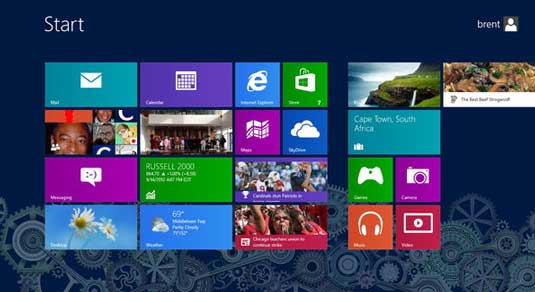
- What’s After Web 2.0 – Web 2.0 was all about skeuomorphic designs that had all things glossy from buttons to shiny surfaces. Almost all the buttons had a tiny bulge with necessary shading and all the options looked clickable giving the users a realistic feel. This design trend was initiated to to bring in the real-life aesthetic qualities in the designs to give a visually interactive impression. Flat designs on the contrary created a web look that was as flat as the name suggests. All the elements that are incorporated in this design trend from the likes of the boxes, to the frames, images and also the buttons are flat but is clear-cut with the help of bright colors and focusing on the usability. It will still take some time for flat design to be crowned as web 3.0 but the growing interests of people towards this design makes us believe that the day is soon approaching.
- Typography and the growing focus on it – Words are one of the stepping-stones towards starting a great conversation and plays a crucial role in telling users what the website talks about or deals with. The use of short and crisp sentences helps in putting the message across simple and straight. The focus on most of the sites is to keep the typography as the eye-catching element of the website. Selecting the typography plays an important role and the font should blend well with the basic flat design style of the website. The typography should be visually appealing which can only take place in flat designs.

- Splashing colors – flat design does not fall flat on your website, but on the contrary there is tremendous scope to use bright colors to make this design stand out. Web designers with the help of flat design are experimenting a lot with a wide palette of colors. Quite a few traditional rules of color combination are broken down to try out new stuff. It has been seen that bright colors work well in all shads of background color be it dark or light. It is with the help of such color co-ordination that designers are able to tap in the interest of the users. With flat design trending in users now have fair chance to explore a variety of colors which would be bright and beautiful.

- Scope for lots of space – we all can guess that flat design requires minimal designing unlike skeuomorphism which often makes the website look too cramped up with all sorts of special effects and features. Flat design is minimalistic eventually giving designers lots of space to work on thus giving them the scope to stuff in large elements without having the fear that the web page will look clumsy. Flat design as an approach is very in your face where the functions are easy to understand and there is free-flow without much distractions. The concept of making things look glossy in your website does not really take place in case of flat design.
- Flat designs and flatter illustrations – we know all things are flat in flat design so much to say that even the illustration and the icons are also flat having a two-dimensional appearance. The flatness make the look of the illustrations have a universal meaning with actions and purposes very clear. The icons seem to catch our attention immediately with the use of solid colors and a distinctly different typography. Hence flat illustration are all the more appealing.

Flat designs have finally paved it ways amidst all the gloss and attractions of skeuomorphic designs. The characteristics are unique and stood the test of time holding on its own. The growing preference of people towards flat design trends show us that people are no longer going for looks but for functionality and purpose. ‘Less is more’ is a glorified phrase and flat design seems to have found meaning in it.

RELATED POST

Startups do not have the privilege of a humongous budget or an enormous manpower like the big brands. Therefore, startups...
READ MORE
To begin with the immediate need for companies to turn responsive, here is a chart to get you an idea...
READ MORE
Table of Contents Functional UX Solutions For a Solid First ImpressionPowering Up With Data-Driven MarketingEmbracing AI and VRHyper-Local Marketing and...
READ MOREPartners


Copyright © 1999-2026, B3net inc.