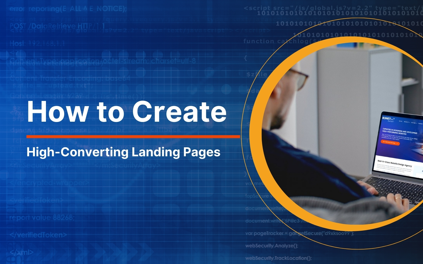
How to Create High-Converting Landing Pages: 14 Best Practices
August 18, 2025 | Ashish Bhaumik
Table of Contents
Do your website visitors decide to stay, click, and convert? Or, just vanish into the void? Because you have just 3 seconds to impress your visitors!
Imagine you own a website. A visitor lands on your page. They’re intrigued, maybe even leaning forward in their chair. But in three seconds flat, they’re gone. Probably, forever!
Your chance to hook them? Vanished into thin digital ether.
But then, even if they linger longer and scroll deeper, do they eventually become your customers?
They should have. But instead, somehow they loiter through the exit way, never to return. Seems familiar?
Why does this keep happening?
Because your landing page didn’t grab their attention.
The web design didn’t pique their interests, didn’t stir their desire, didn’t whisper their deepest needs, didn’t dazzle them with value, didn’t scream, “You need to act. And, you need to act right now!”
It doesn’t matter how many people land on your page if they don’t convert; everything amounts to nothing.
Think about it. You’re paying for ads. You’re investing in SEO. You’re sweating over social media, trying to lure in visitors from all over to your website. And still, your conversion rate is embarrassingly low. Probably, a measly 2 or 3 percent!
Now picture a landing page so sharp, so irresistible, it turns skeptics into buyers and browsers into believers.
Here’s a fact check:
While the average conversion rate hovers around 5 and 6 percent, the best converting landing pages soar beyond 10%, turning casual clicks into contracts.
You keep wondering. How does that work?
The answer lies in not magic, but craft.
Creating a landing page involves a disciplined, proven approach to web design and persuasion. It also includes understanding technology, design principles, human behaviour, and consumer psychology.
Blend these into a strategy and give your visitors an offer they can’t refuse. Chances are, you could hit gold.
In this comprehensive guide, we will find out the best practices for crafting high-converting landing pages that command attention, build trust, and drive action. And, by the end, you will walk away with a plan to create your next campaign that rakes in business like a magnet.
Think of it. As you read through this guide, your prospects are waiting. They are clicking on your website now. Will you send them packing? Or, you welcome them aboard?
Let’s dive in!
Understanding Landing Pages
Imagine a webpage with a single mission and no distractions, focused on getting your visitors to take action. That’s a landing page. It’s not your regular homepage or a casual blog post.
Rather, it’s a precision tool, a focused, conversion-driven experience, specifically designed to ensure every click counts, leading your visitors toward a single, clear action.
Let’s explore in detail what exactly a landing page is and why they are the game-changers for any campaign.
What is a Landing Page?
A landing page is a standalone web page, specifically crafted to achieve a single goal. It’s a web page where a visitor ‘lands’ after clicking a link.
Perhaps, your visitor landed on your web page by clicking on a link from an email newsletter, a Google ad, a SERP (Search Engine Results Page), a social media post, or simply from another link on your website.
No matter where they came from, the ultimate goal of a landing page is to guide visitors and persuade them to take action by clicking on the CTA (Call-to-Action) button.
Your CTA button could be ‘Buy Now’, ‘Subscribe Now’, ‘Sign me up’, ‘Download Now’, ‘Get Your Free Quote’, Schedule a Call’, etc.
Thus, based on its goal, a landing page essentially zeros in on turning your visitors into one of the following:
- Buyers (customers, subscribers, etc.)
- Leads for future prospecting
Why is it a game-changer?
A landing page lies at a crucial juncture of a campaign, and hence could possibly either make your visitors fly away or stay back and convert into a lead or a customer.
A well-crafted landing page incorporates the proven principles of web design, marketing communications, and consumer psychology into a synergy that persuades your visitors to start a new relationship.
Why Landing Pages Win?
- Landing pages can hit conversion rates of 10-20%, dwarfing the 2-5% of typical web pages, including the homepage and blog posts.
- Companies using 15+ landing pages see 55% more leads, fetching the best marketing ROI.
- That number spirals up to 500% more leads when businesses increase their landing pages to 40 or more.
- With a dwindling average attention span, you have got 8 seconds to hook a visitor. Landing pages nail it with focus
Landing Pages That Made History
Landing pages aren’t just webpages; they’re conversion machines. They cut through the noise, speak to your audience, and deliver results. Here’s some proof to gauge and ponder.
- Spotify: A clean “Get Started” page with bold visuals helped them snag more than 200 million active users.
- Squarespace: Their “Build a Website” landing page, with its free trial CTA, fueled a $10 billion valuation.
Types of Landing Pages
Since a landing page has a singular focus, it can vary based on your marketing goal and campaign dynamics. Naturally, their web design, navigational pattern, and behavior shift with each type. Here’s a rundown of the main types:
-
Lead Capture Pages
Purpose: Grab visitor’s information, viz., name, email, contact number, etc., for future personalized marketing communications.
How It Works: You offer a juicy incentive, also known as a lead magnet, like a free ebook, a discount code, or a trial, in exchange for a visitor’s details.
Fact: 96% of marketers consider the visitor’s email address as the most effective lead.
Example: Morning Brew’s newsletter sign-up for people interested in daily business news.
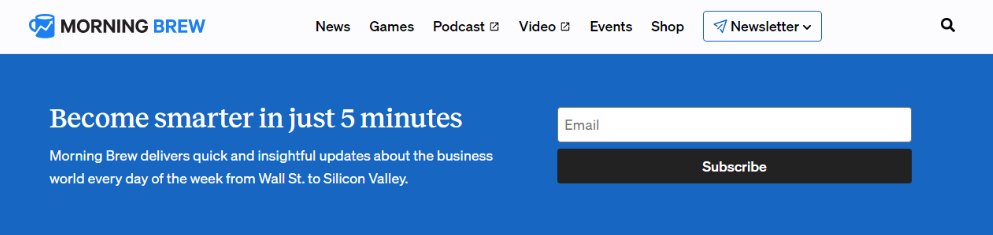
Image courtesy: morningbrew.com Here’s another example. Peloton lures its visitors to share their email address to receive a discount offer on their bikes.
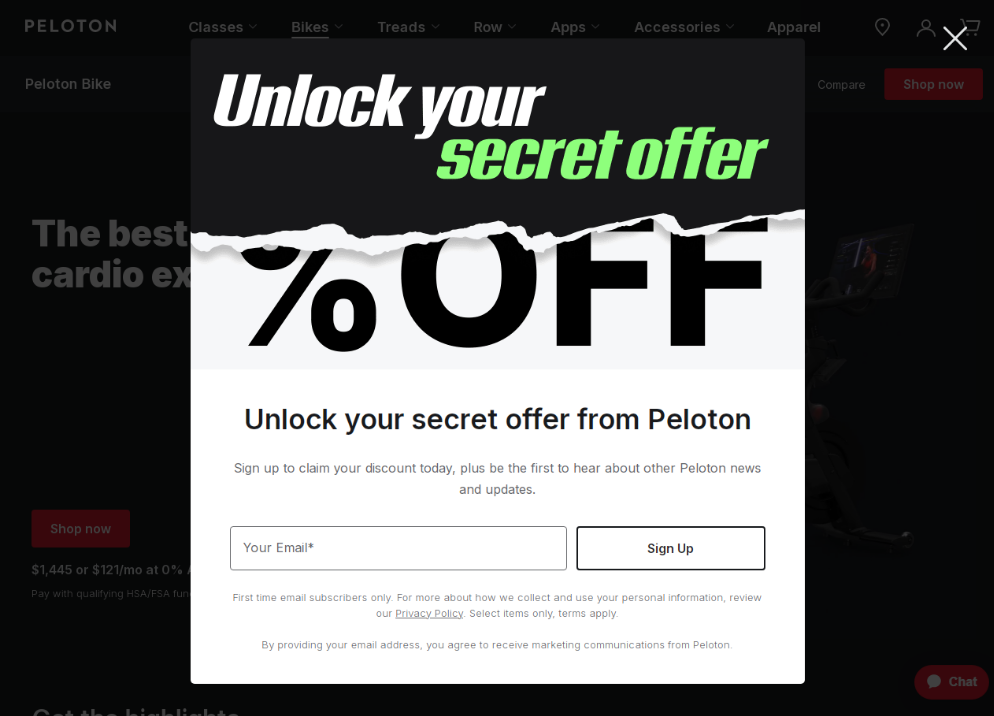
Image courtesy: onepeloton.com/bike -
Click-Through Pages
Purpose: Prepare visitors for a bigger future commitment, like a purchase or a sign-up at a later date.
How It Works: You offer a free sneak peek or a limited-time full access to build excitement and familiarity for your product or service to make an easier future sale.
Fact: Mainly used in e-commerce or SaaS marketing, these pages act as a bridge between an ad and the final purchase.
Example: Google Cloud offers a free credit and usage before it starts charging.
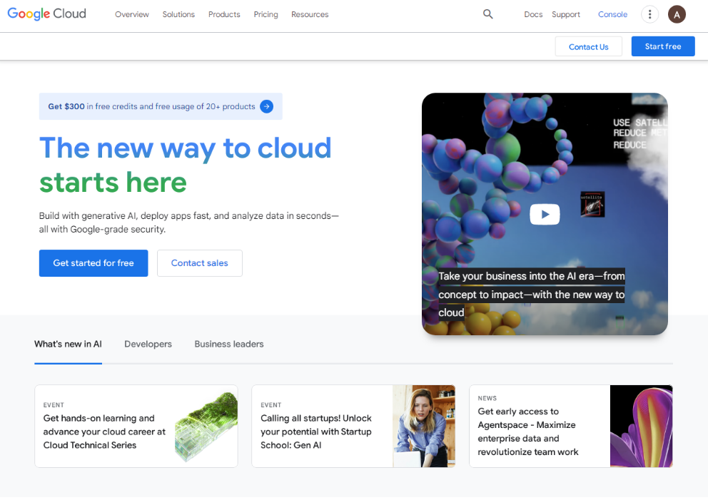
Image courtesy: cloud.google.com -
Sales Pages
Purpose: Directly sell a product or service with compelling copy, stunning visuals, relevant testimonials, tempting offers, and strong CTA.
How It Works: You highlight the benefits rather than going through the features, clearing the objections for purchase with social proofs or a tempting offer for an instant purchase, and push the visitor towards the ‘Buy Now’ button.
Fact: A sales page web design’s objective is to get your visitors to buy. Hence, it can be longer than other landing pages, especially when it comes to complex and bigger purchases.
Example: Tesla offers a lucrative tax credit and financial assistance for ease of purchase.
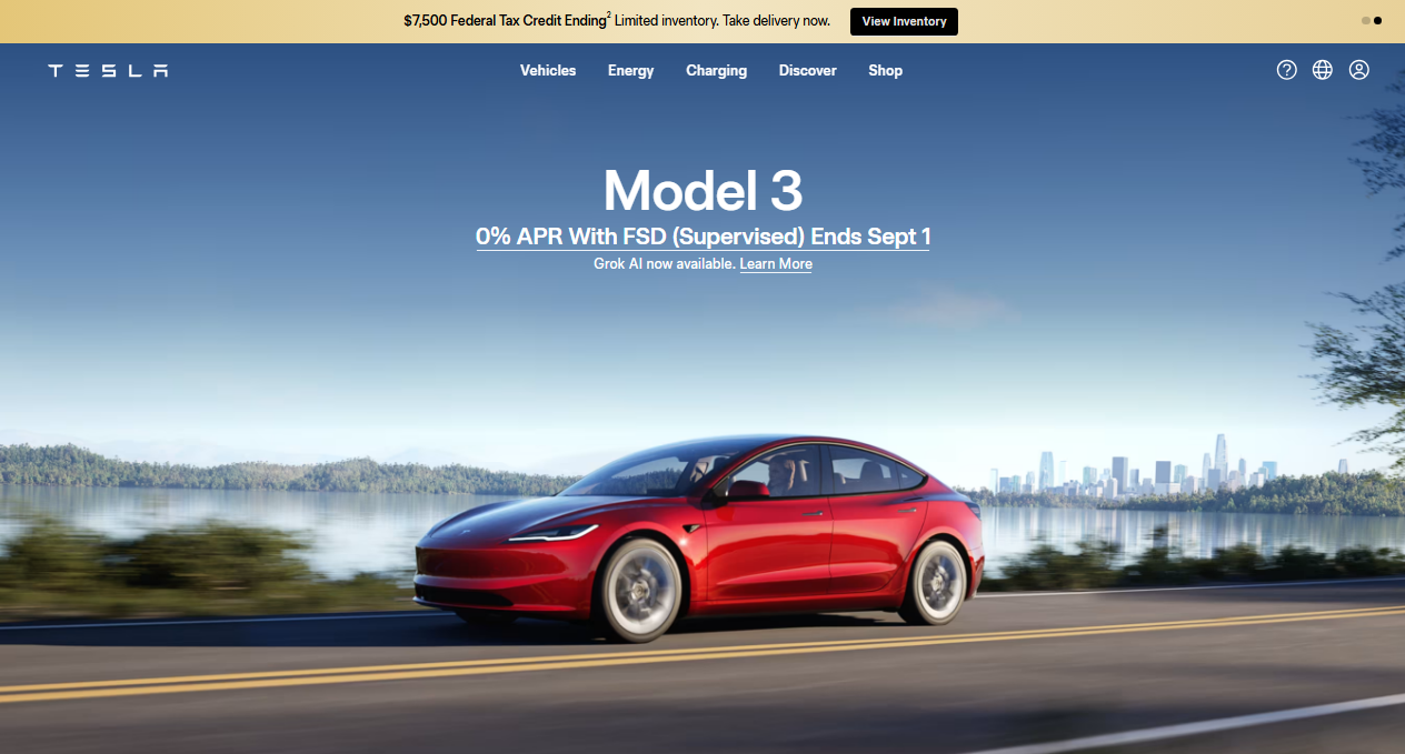
Image courtesy: tesla.com/model3 -
Product Launch Pages
Purpose: You stir excitement into the visitor’s mind by offering snippets of information about the product’s benefits.
How It Works: Flash teasers of what’s coming, often with a ‘Notify Me’ or ‘Pre-Order’ form.
Fact: A well-thought-out launch page web design can create hype and secure future sales even before the product has entered the market.
Example: The launch pages of Apple Inc.’s flagship products, MacBook, iPhones, iPads, and Apple Watches, are a classic example of creating the hoopla and making the customer wait with eager anticipation.
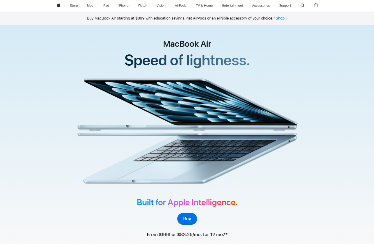
Image courtesy: apple.com/macbook-air/ -
Event Pages
Purpose: You drive sign-ups for upcoming events like webinars, workshops, conferences, or live events.
How It Works: Showcase the details of the event, highlight speakers, topic, venue, along with why attending it is important.
Fact: Visuals feature heavily for celebrity events, whereas texts and facts perform well for events featuring trending current topics.
Examples: Both Websummit and Cornerstone use different formats to create the anticipation for the event.
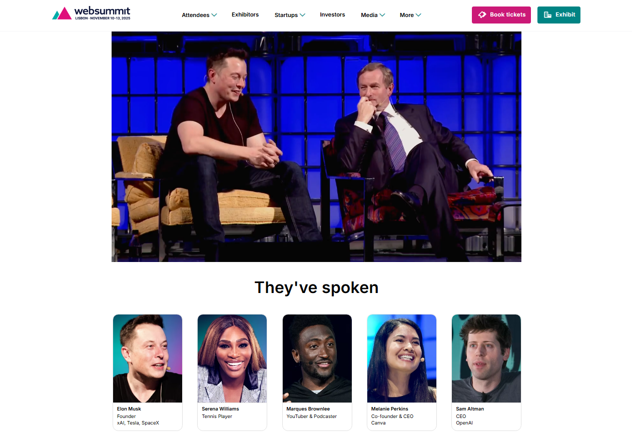
Image courtesy: websummit.com 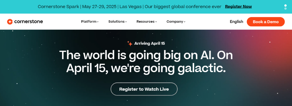
Image courtesy: cornerstoneondemand.com
14 Best Practices To Create a High-Converting Landing Page
Unlike traditional web pages that encourage exploration, a well-crafted landing page web design eliminates distractions and guides users toward a specific goal.
“Every element of a landing page must earn its place. If it doesn’t help conversions, it doesn’t belong.” – Oli Gardner, Co-founder of Unbounce.
Thus, crafting a landing page focused on converting your visitors requires a fine blend of design, perception, and persuasion. It involves some precision tools that will guide the visitors from the moment they land on your site, seamlessly navigating towards the end goal – to make them take action.
Let’s discuss the plan we had promised.
-
The Hero and the Above the Fold Section
A hero section on a landing page web design is the highly visible, attention-grabbing area at the top of the page. It’s the first thing visitors see upon landing any web page, making it a crucial element that determines whether your visitors stay or leave. Its impact is crucial for further engagement.
A well-designed hero section typically features:
- A hero image, comprising a high-quality, visually prominent image, video, or graphic.
- A powerful headline – bold and clear, communicating the value proposition instantly.
- A supporting subheading that adds more information and makes the headline stronger.
- A direct Call-To-Action (CTA) to prompt the user to take that coveted action
- Trust signals, such as social proofs, testimonials, etc., to build credibility and authority.
Why is it important?
It hooks the visitor with crucial and necessary information. A strong hero section sets the tone of the landing page, builds trust, and guides the users further into the site, thereby improving conversions dramatically.
Captivate Visitors Above-The-Fold
If you want users to scroll through your website further, you must first capture their attention with what’s above the fold. This is the visible part of your landing page that visitors see without scrolling. It’s your one chance to make a lasting impression and entice them to explore further.
Why Above the Fold Matters?
In today’s digital landscape, attention spans are short. Users won’t scroll unless they’re intrigued by what they see at first glance. Your above-the-fold content must be concise, engaging, and relevant. It should clearly convey the essence of your landing page and invite users to discover more.
Hero Section vs. Above the Fold
The hero section and above-the-fold are two critical components in web design that work together to create a strong first impression on website visitors. While they are often used interchangeably, there are distinct differences between them.
The Hero section sets the tone for the user’s experience, communicates the brand’s message, and encourages engagement. It includes the Company logo, headline, subheading, visual content (image or video), and a CTA.
On the other hand, above-the-fold refers to the portion of a web page visible without scrolling. It includes the hero section and other essential elements like navigation menus and branding. Its main function is to capture attention immediately and provide critical information that encourages users to explore further.
-
Give Directional Cues For Ease of Navigation
Imagine walking into a store with no signs, no sections, and no clear checkout area. You would probably feel lost and be tempted to leave right there.
The same thing happens when visitors land on a confusing web page. If they do not know where to click or what to do next, they’ll leave without taking action.
To keep them on track, use clear visual cues to guide them, which may include:
- A big, bold headline tells them what the page is about.
- A button in a bright color shows where to click.
- Strategically used arrows, icons, images, and whitespaces that intuitively guide through the site
Good landing page web design should make navigation feel effortless. Make it ridiculously easy for users to know where to go next, without friction or hesitation.
The easier it is for visitors to navigate your page, the more likely they are to sign up, buy, or take the action you want. Keep it simple, clear, and direct. Because a well-guided visitor is a converting visitor.
-
Build A Focused Narrative Throughout
Every high-converting landing page tells a story.
It’s not just a collection of words and buttons. Rather, it’s a guided journey that takes the visitors from curiosity to conviction.
And the secret to making this journey seamless lies in a focused narrative that keeps them engaged, removes doubts, and leads them straight to action.
Picture your landing page as a story you are telling to your visitors. As with a good story, a well-crafted landing page copy will feature a clear beginning, middle, and end.
- An attention-grabbing beginning that speaks directly to your visitors, resonating with their problem, curiosity, or desire.
- A resonant, persuasive copy in the middle that keeps them engaged and informed, subtly transforming their doubt into conviction, altering their scepticism into belief, and taking them to a place where they begin trusting and appreciating their own decision to land on your page.
- By the time they read the end, your visitors are knowingly convinced to take that action.
A good, focused narrative does it all effortlessly, making it seem organic. Here are a few pointers to adhere to:
Message Congruency
Every word, image, and button must align with your core message. If your connecting link (the link from where your visitor landed on your page, viz., email, ad, etc.) promised a free ebook, your landing page must deliver exactly that.
Clearly, no surprises or deviations. Otherwise, the visitors can feel agitated, cheated, and confused. You don’t want that to happen. Hence, deliver on your promise.
Master Persuasive Copywriting
Your words should do more than inform. They should inspire, motivate, and empower.
Instead of saying, “Our software improves productivity,” paint a picture. For instance:
“Imagine getting twice the work done in half the time, without the stress! Our software does exactly that, effortlessly.”
Use emotional triggers and speak directly to the reader. Use “you” more than “we.”
Remember, it’s more about the visitor and the benefits they would get, rather than anything else. Keep it crisp, clear, and conversational.
Instead of saying, “We build mobile-responsive websites,” bring the reader to the forefront. Get them to understand what they get. For instance,
“Give your audience a flawless experience, even on the go. Get a website that works on any device – mobile, tablet, or PC.”
When your story flows, your message stays strong, and your CTA is laser-focused. When that happens, visitors don’t just read. They take action.
Here’s a Pro tip: If you master persuasive landing page copywriting, you will understand that each part is just another CTA. Each smaller, subtler CTA leads to the primary goal, the main CTA of the page.
Thus, it becomes all the more important to build a cohesive, focused, singular narrative throughout.
-
Give a Clear Value Proposition and Call To Action
Visitors don’t land on your page for fun. They’re here because they want something. Perhaps, faster results, a better solution, a way to solve their problem.
Your job is to make it crystal clear why they should choose you.
Your value proposition is the reason they stay. It’s the promise you make, the benefit you deliver, and the reason they should care.
Say it fast and quick, say it boldly, and say it in a way that makes them think, “Yes, this is exactly what I need.”
The Power of a Single, Irresistible Call to Action
Once they’re hooked, don’t make them guess what to do next. Tell them. Loudly. Clearly.
- Use a strong, benefit-driven CTA. Instead of “Submit,” say “Get My Free Guide.”
- Make it impossible to ignore. A bold button with a color that stands out and a message that excites.
- Keep it singular. Too many choices lead to no action. Guide them to one outcome.
If your value proposition is the “why,” your call to action is the “what now.”
Get both sorted out and merge them into one synergy, and your landing page won’t just attract visitors, it will convert them.
-
Leverage On The Human Urge To Act
“People are wired to take action.”
Wait for a moment, ponder over that statement, and let it sink in.
Your visitors are wired to take action. Either they like your offer or they completely hate it. Either they will leave upright, or they will stay back to find out more. People can’t help not take any action.
The question is, “Are you guiding them to take the right action? Moreover, are you making them FEEL the NEED to ACT Right, and do it Right NOW?”
That happens only when the right triggers push them forward.
A high-converting landing page doesn’t just present an offer; it taps into psychological motivators that make visitors feel compelled to act now.
Here are a few ways to trigger your visitor’s motivating factors.
-
Create Urgency and Scarcity
Nothing speeds up decision-making like the fear of missing out (FOMO). When people believe an opportunity is limited, they’re far more likely to take action.
- Scarcity: “Only 5 spots left. Claim yours before they’re gone!”
- Urgency: “Offer expires in 3 hours. Get it before it’s too late.”
Use countdown timers, limited availability, and time-sensitive bonuses to fiddle and nudge that “act now” urge.
-
Social Proof: The Bandwagon Effect
Humans follow the crowd. That’s what eventually led to the creation and evolution of society, social norms, and social behaviour.
Fear of the unknown and a sense of security are deeply ingrained at the crux of human gatherings.
If others trust you, new visitors will too. Give your visitors a sense of security. Highlight testimonials, case studies, and user-generated content to make your offer feel ‘safe and proven’.
- “Join 10,000+ happy customers who’ve already transformed their businesses.”
- Show real reviews, ratings, and success stories.
When people see others benefiting, they’re more likely to jump in.
-
Reduce Risk with Guarantees
Fear of loss stops people from acting. Remove their hesitation with a strong guarantee
- Money-back promises: “Try it for 30 days, risk-free.”
- Hassle-free returns: “Love it or get a full refund, no questions asked.”
When there’s no risk, the decision becomes easy.
-
Make It Easy to Say “Yes”
Complexity kills conversions. Keep your CTA simple, direct, and action-driven. Instead of “Sign Up,” say:
- “Get Instant Access”
- “Start Your Free Trial”
- “Claim Your Discount Now”
People naturally want to act. Your job is to make the decision urgent, exciting, and effortless. Do that, and conversions will follow.
-
-
Optimize Your Brand Assets
Brand assets are the visual and non-visual elements that represent your brand identity.
Everything, from logo, color palette, typography, tagline, and even the tone of voice of your landing page copy, is a brand asset, including trust signals.
Elements of trust signal include:
- logos of partners, clients, etc.
- certifications and badges,
- social, client, employee, stakeholder, and celebrity testimonials.
Together, these elements form a part of your brand asset, which contributes to making your brand.
Your brand assets go a long way in determining the way your visitors feel and perceive your business.
A high-converting landing page doesn’t just sell. It reinforces your brand in a way that makes people think, “This is exactly what I’ve been looking for.”
And, brand assets contribute towards making that perception memorable. People decide whether to trust a brand in milliseconds.
Your logo, colors, typography, and images within the entire web design must be polished, consistent, and professional. Stick to a cohesive brand style. Your landing page shouldn’t feel like a different company from your website, ads, or emails.
A strong brand isn’t just about looking good. Rather, it’s about feeling right. If your brand is bold and edgy, your landing page should reflect that.
If it’s premium and elegant, every detail should exude sophistication. Match your copy’s tone with your brand voice and ensure it’s consistent throughout.
-
Incorporate Trust Signals
In the digital realm, where there is no personal contact between the customer and the brand, trust becomes paramount for business.
Without trust, your visitors are unlikely to convert, no matter how compelling your offer is. This is where trust signals come into play.
Trust signals are elements or features on your landing page that reassure visitors they are dealing with a reputable business or website.
These signals reduce anxiety, increase confidence, and ultimately improve conversion rates.
Trust signals help to alleviate any doubts or concerns visitors may have and reinforce the legitimacy of your brand.
Incorporating trust signals in your landing page will reduce friction, remove hesitation, and smoothen conversion.
-
Security Badges and Seals:
They reassure visitors that their information and personal details are protected.
Studies reveal that 84% of visitors will abandon a purchase if they notice that the site is not secure.
Incorporating relevant and updated SSL certificates, security badges, and certifications boosts confidence among customers about doing a clean and reliable business transaction with your business.
-
Testimonials and Social Proofs
Social proofs and positive testimonials from satisfied customers are powerful elements to reinforce confidence in your visitors.
42% of consumers trust reviews as much as personal recommendations
Feature authentic testimonials with names and photos. Consider using video testimonials for added impact.
-
Professional Affiliations, Certifications, and Partner Logos
If your business has affiliations from reputable organisations or holds industry-recognized certifications, displaying their logos and relevant details will seal the visitor’s confidence further.
So is the case with partner logos and client logos. If they are renowned names, state that fact.
Similarly, if your business has featured in prominent media, news outlets, or magazines, mentioning it gives you the upper hand.
-
-
Clean, Focused Design
A landing page without a clear information hierarchy or a focused design can easily overwhelm visitors.
When users don’t know where to look first, they’re more likely to leave the page without converting.
Focused design ensures the visitor’s attention is directed precisely where you want it, and information hierarchy ensures that this focus moves logically from one element to the next.
A Stanford report states that a simple, clean, and focused design lends credibility to your website.
A focused design means creating a page that eliminates distractions and keeps the user’s attention on the critical elements. The elements that matter which is the offer and the CTA.
Whether it’s getting a user to sign up, purchase, or download something, your landing page should be designed with a single goal in mind.
Keep the visitor’s attention where it matters by minimizing competing elements, such as too many links, details, or offers.
A focused landing page web design incorporates information hierarchy to its best advantage.
It is the strategic arrangement of elements on a landing page to guide visitors’ attention to the most critical information first, leading them naturally toward conversion.
A well-thought-out hierarchy ensures that users can easily navigate the page without getting distracted or confused.
The two main characteristics of information hierarchy are:
- Logical Flow: Arrange the page elements in a way that naturally leads the visitors to scroll and reach the bottom of the page (ideally towards your CTA).
Begin with the most crucial details, then support them with further information, and finish with a CTA. Ensure that the visitor feels guided throughout and not lost. - Order of Prominence: To make the flow of the landing page content logical, the prominent details must be highlighted and given precedence over other details.For example, headlines must be in the most prominent typeface, followed by the subheadings. Any details, links, etc., within the body text must be highlighted with different contrasting colors, italics, or bold fonts.
ProTip:
A clear winner here is wisely using whitespace. It allows the content of your landing page to breathe and keeps it from feeling overcrowded. It also ensures that the user is drawn to the most important elements without distraction.
- Logical Flow: Arrange the page elements in a way that naturally leads the visitors to scroll and reach the bottom of the page (ideally towards your CTA).
-
Leverage On High-quality Visuals, Imagery, and Media
Check the following fascinating facts about the human brain:
- 90% of the information transmitted to the brain is visual.
- The brain takes 13 milliseconds to process an image, which is 60,000 times faster than processing text.
Now consider the following results about consumer behavior when it comes to visual images:
- 67% of consumers consider product image as an important decision factor while shopping.
- Pages with images garner 94% more views than those that don’t have any images.
- Incorporating videos in your landing page can increase your visitors’ stay.
Images and media are more than just visual tools. They can also evoke emotions that influence decision-making. Whether it’s a smiling customer, a product in action, or a beautiful landscape, images have the power to connect with users on an emotional level.
Use high-quality product images or videos to give your visitors a more enhanced perception of your product. Show multiple angles of your product, and if possible, include zoom functionality. This empowers the visitors with a deeper and wider glimpse of the product.
ProTip: Optimize your videos and imagery for mobile viewers by compressing the file size and optimizing it for a mobile-first experience.
-
Harmonize Texts and Colors
However much you lure visitors with images and visuals, texts will still be the nailing factor to close the deal.
When creating high-converting landing pages, harmonizing texts and colors is a crucial web design element that can have a big impact on user experience, readability, and conversions.
The right combination of typography and color schemes not only makes the content easier to read but also strengthens the message, sets the mood, and guides users toward taking the desired action. In other words, a landing page that speaks to your visitors.
-
Text Readability and Typography
The style, size, and arrangement of texts play a huge role in how easily visitors can read and comprehend your landing page.
The best typography practices stick to two font types for a clean and distinct appeal. Anything more is a distraction. Bold headlines demand attention. Make them stand out from the rest of the body text. However, smaller texts should be easy on the eyes.
Use contrast to your advantage. For instance, dark texts on lighter backgrounds and vice versa. This ensures an effortless reading experience.
-
The Role of Colors In Evoking Emotions
Colors influence brand perception, consumer behavior, and purchase decisions in a major way.
To what extent?
Colors make up to 90% of a product’s first impression and drive 85% of consumer purchase choices.
Different colors evoke different emotions and associations, which can significantly impact user behavior. By harmonizing text and color, you create a visual flow that makes your message clear and emotionally engaging. Here are a few examples:
- Red: Associated with urgency, excitement, and passion. Often used for CTA buttons or sales.
- Blue: Associated with trust, calm, and reliability. Commonly used for backgrounds or headers.
- Green: Represents growth, health, and peace. Ideal for environmental or wellness brands.
Yellow: Evokes energy, optimism, and attention. Often used for highlighting key messages or CTAs. - Orange: A combination of red’s energy and yellow’s optimism, often used to evoke enthusiasm and call-to-action urgency.
Choose colors that align with your brand’s message and values. For example, if you’re offering a financial service, blue can help convey trustworthiness, while green might be ideal for eco-friendly products.
CTA Button:
Your CTA button is the real deal. Make it stand out, but keep it in sync with your brand’s color theme and typography. It should catch the eye, not stink it.
-
-
Optimize For Key SEO Parameters
Landing page conversions do not just mean making the visitors take the right action. It also means attracting the right visitors and making them land on your site.
A high-converting landing page doesn’t just show up to visitors on its own. It’s optimized for key SEO parameters so that your page shows up to relevant searches and the user finds you whenever they search.
Getting found by your visitors needs a bit of technical expertise. Let’s delve into the key ones that must be covered.
Keywords
Identify and focus on keywords, phrases, and queries relevant to your landing page that users are searching for. Incorporate these in your landing page copy in a seamless manner. Use natural language semantics to include these keywords.
Pay special emphasis on incorporating the keywords in:
- Title tags
- Meta descriptions
- headings (H1, H2, H3, etc.)
- Image Alt texts.
Optimize Page Speed
Slow loading pages can deter conversions to a high degree. The bounce rate spirals up to 32% if your landing page loading time goes beyond 3 seconds.
Compress images, minimize HTTP requests, leverage browser caching, and use a content delivery network (CDN) to quicken your landing page’s loading time.
Content, Context, and Relevance
Ensure your content is high-quality and aligned with the keywords you are targeting. Any out-of-context and irrelevant content, including keyword stuffing, will harm the performance of your landing page. If your visitors cannot find it, they won’t land on it.
Finally, optimize the URLs and use short, descriptive URLs that include your keyword.
For example, use www.yoursite.com/landing-page-keyword instead of www.yoursite.com/123456.
-
Give A Seamless Mobile Experience
With over 62% of all web traffic coming from mobile devices, your landing page must provide a seamless experience across all screen sizes.
Nearly 80% of global retail website traffic originated from smartphones, and more than 60% of internet users start their product research on mobile devices. Hence, adapting a mobile-first web design has become paramount for the success of a landing page.
A mobile-first design approach means prioritizing the mobile version of your landing page before adapting it for desktop users.
Use responsive design, which automatically adjusts your page layout, images, and fonts to suit the user’s screen size. This means your page will look and function beautifully on all devices—whether it’s a smartphone, tablet, or desktop.
Mobile users are often on the go, and they don’t have the patience to wait around for slow-loading pages. Page speed is even more important on mobile, as slower load times can result in higher bounce rates.
Mobile screens have limited space, so content should be short, snappy, and to the point. Mobile screens are smaller, so cluttered navigation menus can quickly overwhelm users. A clean, simplified layout will help visitors find what they need without feeling confused or frustrated.
On mobile devices, users interact with their fingers, not a mouse. This means your call-to-action buttons need to be larger and easy to tap.
If the mobile version of your landing page web design has forms for lead generation, ensure they are easy to fill out.
Use auto-fill options and ensure input fields are large enough for users to easily type.
Also, empower and enable the users with easily tappable date pickers or dropdown options. This ensures quicker conversions and happy leads.
-
Incorporate Heat Map Metrics
Heat maps are powerful tools that allow you to visually understand how visitors interact with your landing page.
Heat maps provide a visual representation of how users interact with your landing page. They track:
- Click Maps: Show where users click on your page, revealing which sections of your copy are attracting the most attention.
- Scroll Maps: Reveal how far and deep users are scrolling down your landing page.
- Hover Maps: Indicate where and for how long users are hovering their mouse cursor.
Effective use of Heat map tools can help in:
- Refining content placement to ensure the page (and your CTA) receives maximum clicks
- Refining content structure and layout to ensure streamlined action
- Refining content type, viz., replacing texts with images or incorporating video testimonials, etc., to ensure increased engagement and click-through-rate.
- Refining the content narrative and natural flow to ensure the copy is focused throughout.
-
Track Landing Page Metrics
Tracking the right landing page metrics is essential for understanding how well your page is performing and where improvements are needed.
You may have a beautifully designed page, but without the right data, you won’t know what’s working and what isn’t.
Here are the crucial ones you should keep your eyes on:
-
Conversion Rate
This is the most crucial metric for your landing page web design, because it measures the success of the page directly. It reveals the percentage of visitors who complete the desired action on your landing page, such as signing up for a newsletter, making a purchase, downloading a guide, etc.
Track conversion rates regularly to identify which elements of your page, like CTAs, images, or forms, may do well with a little tweaking. A low conversion rate might signal that something isn’t resonating with visitors.
-
Bounce Rate
The bounce rate is the percentage of visitors who land on your page but leave without taking any action. A high bounce rate typically indicates that visitors didn’t find what they were looking for or were dissatisfied with the experience.
If your bounce rate is high, revisit your landing page content, design, and messaging to ensure it aligns with your audience’s expectations. Also, check for technical issues like slow load times, which can cause visitors to leave quickly.
-
Click-Through-Rate (CTR)
The click-through rate (CTR) measures how many visitors actually clicked on your call-to-action (CTA) button compared to how many merely saw it.
It helps you understand how compelling your CTA is and whether it’s encouraging visitors to take the next step.
To improve CTR, test different versions of your CTA button by varying the words, colors, layout, or placement. Here, A/B testing your CTA button can help you find the most effective combination.
-
Average Time On Page
This metric tells you how long visitors are staying on your landing page. If people are spending a lot of time on the page, it’s usually a sign that they find your content interesting and therefore are engaged with it.
On the other hand, if the time spent is very short, it may mean that visitors aren’t finding the information they need quickly enough.
If the time spent is too long, but the conversion rate is abysmally low, it indicates that the users are struggling to find what they need.
-
Form Submission Rate
If your landing page includes a form, then this is one of the most critical metrics. It reveals how many people are filling out the form and submitting it, versus the number of people who saw it.
Statistics reveal that form abandonment rates can be as high as 81% if the forms are complicated, lengthy, or confusing.
Simplify your forms by only asking for essential information. The fewer fields you have, the more likely users will submit them.
-
Traffic Sources
Your visitors may end up on your page via organic search, paid ads, social media, or email campaigns. Understanding where your visitors are coming from, i.e., the source of the traffic, is essential for evaluating the effectiveness of your marketing efforts.
Optimize the channels of your marketing based on the performance of traffic sources. For example, if social media visitors have a high bounce rate, you may need to either tweak your social media messaging or tailor it for that audience.
-
Hook Your Visitors and Turn Them Into Loyal Customers
There we have it. The plan that can make your landing page web design rake in businesses like a magnet. Creating a high-converting landing page isn’t about fancy gimmicks. It’s about understanding what your audience craves, what stops them dead in their tracks, and what drives them to act.
Every headline, every image, every call to action must be laser-focused on one thing. Converting visitors into loyal customers.
You have only seconds to make an impression on your visitors, but those seconds are precious. If you can harness the power of compelling copy, captivating visuals, and data-driven decisions, you’ll build a landing page that works like a finely-tuned machine that attracts, engages, and converts.
B3NET Inc. Crafts Landing Pages That Make Action Irresistible
Imagine. Every person who visits your website is your potential customer. But are they seeing what you want them to see? Are they feeling the urge to ACT right NOW?
At B3NET Inc., we don’t just build landing pages. We engineer such conversion-focused precision tools that will make your visitors take that action.
We understand that your business is unique. And your audience has their tastes, demands, and desires to match up. We begin by listening. Deeply. We immerse ourselves in your brand, your market, and your goals. Then, the magic begins.
We don’t guess. We know for sure when we delve into the digital footprints of your ideal customer. We analyze their behavior, understand their motivations, and combine insights with your business goals to craft a landing page web design that resonates, that compels, that converts.
Reach out to our team today, or explore our portfolio to ignite your next project.

RELATED POST
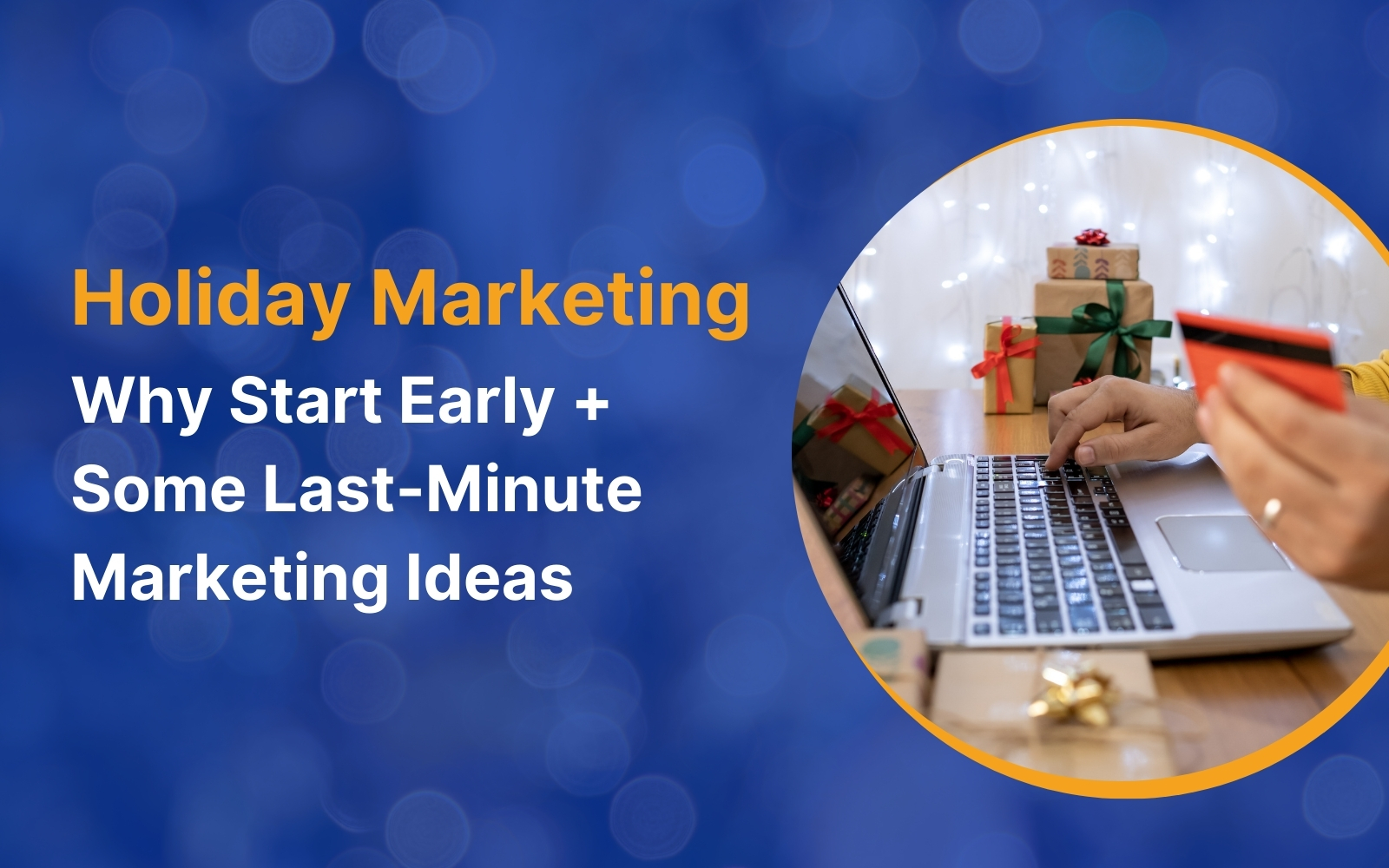
Table of Contents When to Commence Your Online Holiday MarketingAdvantages of Early Holiday MarketingEffective Strategies for Early Holiday MarketingPerform Early...
READ MORE
Table of Contents Why is Responsive Web Design Important?Responsive Web Design – The FeaturesEnhanced User ExperienceThe term Responsive Design was...
READ MORE
Many businesses miss out on extremely profitable marketing methods because they consider email marketing to be outdated. Sure, email marketing...
READ MOREPartners
Copyright © 1999-2026, B3net inc.