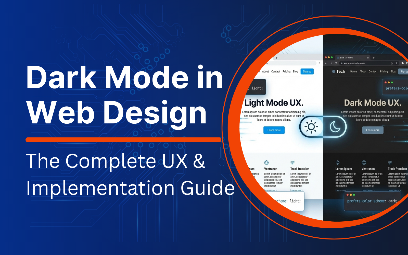
Dark Mode in Web Design: The Complete UX & Implementation Guide
January 19, 2026 | Sebastian Glendale
Table of Contents
- What Is Dark Mode In Web Design?
- Key Benefits Of Dark Mode In Web Design
- 5 UX Design Rules To Follow When Building A Dark Theme For Websites
- How To Implement Dark Mode In Web Design Step-by-Step
- Things to Verify Before Activating Dark Mode in Web Design: The Ultimate Testing Checklist
- Common Mistakes While Activating Dark Mode In Web Design And Quick Fixes
- FAQs:
View this. It’s late at night, the lights are dim, you pick up your phone to open a website, and boom! The screen brightens up like a flashlight in your eyes. You squint, move your phone away, and instinctively hit the back button. Yeah, we’ve all been there. That’s precisely why the dark mode exists.
But it’s not just about the discomfort. Dark mode in web design is a welcome move that breaks hierarchy, improves readability, hides screen borders, and matches web accessibility requirements. Essentially, it’s a sum of parts for a smart design system comprising tokens, states, palettes, and assets.
In this blog, you’ll learn all about building dark mode, its benefits, ways to implement, and the UX rules to blow up interfaces.
What Is Dark Mode In Web Design?
Dark mode in web design is a unique UI appearance built using a dark color palette for surfaces (like page background panels, cards). Typically, a dark mode uses lighter foreground colors for text and other interactive elements. Most modern digital systems include dark mode option as a user preference option at the OS/browser level. All websites can detect dark mode using the CSS media feature prefers-color-scheme.
However, one must remember that a dark mode in web design:
- Doesn’t mean inversion of light mode colors
- Doesn’t guarantee better accessibility
- Is never a shortcut to “premium look” replacing usability testing
Key Benefits Of Dark Mode In Web Design
Dark mode in web design is now a part of almost every product design roadmap for more than one reason.
- It allows you to read from screens comfortably under low-light: Tech giants like Apple have adopted dark mode as a system-wide feature. This indicates that users often switch to dark mode on multiple occasions, like long work sessions on the phone, night-time browsing, and reading in a dimly lit room.
- It reduces battery draining: Dark mode has shown some positive numbers on battery consumption, especially for OLED/AMOLED screens. Thanks to truly black pixels that are less power-hungry. However, in real-time practice, dark themes on many devices use gray instead of true black (for more depth). So, battery consumption figures can vary.
- It reduces the impact of blue light: According to a study by the American Academy of Ophthalmology, dark mode reportedly reduced blue light exposure. This is in stark contrast to light mode, which uses warmer colors that confuse the human brain, tricking it to believe its day time.
The last few years saw people increasingly using the dark mode on their devices, whether at home or work. From browsing business dashboards to nighttime reading, dark mode is no longer a good-to-have option; it’s a must-have. And it’s not just about people’s habits. Technically speaking, dark mode also helps when the web user interface has multiple surfaces and different components like tables, cards, and panels.
However, dark mode does very little for smaller websites with fewer transactional pages and even fewer surfaces to work with. Besides, keeping the dark mode option demands commitment to maintaining two different themes, which not all developers are good with.
5 UX Design Rules To Follow When Building A Dark Theme For Websites
Before building a dark theme for your website, here are some of the basic UX rules to know.
Rule 1: Never use pure black as your default palette
Avoid pure black to prevent “Halation” and eye strain. Using pure black (#000) with pure white text (#FFF) creates extreme contrast that causes a visual phenomenon called halation. This is where text appears to “bleed” or blur into the background, a problem particularly painful for users with astigmatism.
Instead, use a deep dark gray (like #121212) and an off-white or light gray (like #E1E1E1) for text. This maintains accessibility while significantly reducing optical vibration.
Rule 2: Build the surface in layers, not with just one background color
Higher elevation must equal a lighter surface. In light mode, we use shadows to show depth. In dark mode, shadows are often invisible. To create hierarchy, follow the physics of light: the “closer” an object is to the user, the more light it catches.
If your base background is your darkest gray, your cards should be a slightly lighter gray, and your modals should be lighter still.
Rule 3: Desaturate the accents and improve luminance
Saturated colors can give a vibrating appearance on dark backgrounds, and therefore fail to meet the WCAG contrast requirements. A good approach would be to reduce the saturation and increase the luminance. Also, verify the contrast for text on accent backgrounds (like button labels and badges).
Rule 4: Treat borders, dividers, and disabled states as first-class design
Borders tend to disappear across dark themes as they either look too dark or too bright. So, use subtle borders and confident spacing across different surface levels for proper structure.
Rule 5: Ensure high contrast for focus indicators
Dark mode in web design can break the focus indicators. If users can’t find the focus, there’s no point in implementing dark mode for your website. The idea is to ensure high contrast for focus indicators against the current surface.
How To Implement Dark Mode In Web Design Step-by-Step
Here are the steps to follow for implementing dark mode in web design in a production-friendly manner using tokens, system preferences, and a manual toggle.
Step 1: Use design tokens
Tokens help keep the UI consistent and prevent random hex code drifts. Here’s an example.
:root {
/* surfaces */
–bg: #ffffff;
–surface: #f6f7f9;
–surface-2: #eef1f5;
/* text */
–text: #111318;
–text-muted: #4b5563;
/* borders */
–border: #e5e7eb;
/* accent */
–accent: #2563eb;
–accent-contrast: #ffffff;
/* focus */
–focus: #2563eb;
}
Step 2: Stick to system preference using prefers-color-scheme
Prefers-color-scheme readily detects whether the user has requested light or dark mode using OS/browser settings. Here’s how it works.
@media (prefers-color-scheme: dark) {
:root {
–bg: #0f1216;
–surface: #151a21;
–surface-2: #1b2330;
–text: #e7eaf0;
–text-muted: #aab3c2;
–border: #263041;
–accent: #7aa2ff;
–accent-contrast: #0b1020;
–focus: #7aa2ff;
}
}
Step 3: Apply tokens accordingly
body { background: var(–bg); color: var(–text); }
.card { background: var(–surface); border: 1px solid var(–border); }
a { color: var(–accent); }
:focus-visible { outline: 2px solid var(–focus); outline-offset: 2px; }
Step 4: Add a manual toggle
The best user interfaces always follow default system preference with the option to let the user override and remember the choice. Here’s a practical demonstration.
HTML
<button type=”button” id=”themeToggle” aria-label=”Toggle theme”>Toggle theme</button>
CSS override (wins over system preference)
:root[data-theme=”light”] { color-scheme: light; }
:root[data-theme=”dark”] { color-scheme: dark; }
/* Optional: repeat token sets here to force theme */
:root[data-theme=”dark”] { /* dark token values */ }
:root[data-theme=”light”] { /* light token values */ }
Early script (prevents “flash” of the wrong theme)
<script>
(function () {
const saved = localStorage.getItem(“theme”); // “light” | “dark”
if (saved === “light” || saved === “dark”) {
document.documentElement.setAttribute(“data-theme”, saved);
}
})();
</script>
Toggle behavior
<script>
document.getElementById(“themeToggle”).addEventListener(“click”, () => {
const root = document.documentElement;
const current = root.getAttribute(“data-theme”);
const next = current === “dark” ? “light” : “dark”;
root.setAttribute(“data-theme”, next);
localStorage.setItem(“theme”, next);
});
</script>
Step 5: Instruct the browser to support both light and dark schemes
This is an advanced implementation for dark mode in web design that makes things appear more native. The color-scheme CSS property helps the browser render built-in UI (including form controls, scrollbars, and other UA UI). So, you should always add both in the following manner:
<meta name=”color-scheme” content=”light dark”>
:root { color-scheme: light dark; }
MDN documents the purpose of <meta name=”color-scheme”> and how order implies preference.
Step 6: Use light-dark() where it helps
Use the light-dark() function for streamlined CSS. The light-dark() function allows you to define two colors in one property.
Crucial: This function only works if you have defined color-scheme: light dark; on the :root or a parent element. Without this declaration, the browser will default to the light value regardless of system settings.
:root { color-scheme: light dark; }
body {
background: light-dark(#ffffff, #0f1216);
color: light-dark(#111318, #e7eaf0);
}
Step 7: Server-side rendering (SSR) to be done without a theme flash
If you use SSR (Next.js, Remix, Rails, etc.), you can easily:
- Store the theme choice using a cookie
- Render data-theme=”dark” server-side
- Allow system preference to handle the default if there’s no cookie
On the other hand, if you want the preference set at the request time, use an HTTP Client. For example, Sec-CH-Prefers-Color-Scheme allows the server to tailor the right responses.
Step 8: Pay attention to high-contrast preferences
Some users can explicitly request higher or lower contrast. Use prefers-contrast to detect the same. For example, in Windows high contrast mode, use detect forced-colors. This allows working with a higher-contrast dark palette (i.e., strong text and focus) and simplified borders and overlays that still remain visible under forced colors.
Step 9: Use theme-aware assets like images, icons, charts, favicons, and browser UI
Use the wrapper tag <picture> to swap images and assets. Here’s how to use it best.
<picture>
<source srcset=”/hero-dark.png” media=”(prefers-color-scheme: dark)”>
<img src=”/hero-light.png” alt=”Product hero image”>
</picture>
Additional tips to follow:
- Desaturate and dim images to reduce glare. Large, bright images can be jarring on a dark UI. Rather than creating two versions of every image, you can use a CSS filter to subtly dim them when the dark theme is active:
@media (prefers-color-scheme: dark) {
img:not([src$=”.svg”]) {
filter: brightness(0.8) contrast(1.1);
}
}
- Set the browser UI theme colors: Provide different theme-color values for light and dark schemes in the following manner:
<meta name=”theme-color” content=”#ffffff” media=”(prefers-color-scheme: light)”>
<meta name=”theme-color” content=”#0f1216″ media=”(prefers-color-scheme: dark)”>
Things to Verify Before Activating Dark Mode in Web Design: The Ultimate Testing Checklist
- Check the contrast for body text, small text, and muted text.
- Check the button labels and backgrounds, placeholders, input borders, charts, badges, and tags.
- Use WCAG thresholds as pass or fail.
- For keyboard navigation, ensure the focus remains visible on every interactive element.
- Ensure modals trap focus correctly.
- Check for menus, dropdowns, and date pickers.
- Check different states like hover, active, disabled, error, success, and visited links.
- Check for forms like native controls with color-scheme enabled.
- Verify the images and logos against both light and dark backgrounds.
- Activate dark mode across real environments like dim room, bright room, low brightness, and outdoor glare.
Common Mistakes While Activating Dark Mode In Web Design And Quick Fixes
Mistake: Pure black backgrounds are used everywhere.
Fix: Instead, go with deep gray and elevated layers across lighter surfaces.
Mistake: All brand colors look neon.
Fix: Reduce the saturation and increase the luminance.
Mistake: Borders disappear or appear chalky.
Fix: Use subtle borders and work with surface levels to avoid high-contrast outlines.
Mistake: The focus ring is invisible.
Fix: Design the focus colors as tokens and test for keyboard flows.
Mistake: Hardcoded SVG colors. SVGs with fill=”#000″ will disappear in dark mode.
Fix: Set SVG fills to currentColor so they automatically inherit the text color of their parent container.
Mistake: Forgetting the system scrollbar. A bright white scrollbar on a sleek dark website ruins the immersion.
Fix: Ensure color-scheme: dark is applied to the <html> or :root level; modern browsers will automatically theme the scrollbar to match.
FAQs:
Is dark mode in web design better for accessibility?
Dark mode in web design can help some users, especially those with light sensitivity. However, it can reduce readability for others if the contrast and typography aren’t tuned right. So, the best approach is to allow both light and dark themes in line with WCAG contrast rules.
What WCAG contrast ratios should be maintained for dark mode in web design?
To implement dark mode in web design correctly, maintain the recommended WCAG contrast ratios at Level AA: 4.5:1 for normal text, 3:1 for large text, and 3:1 for key UI components and graphics against all adjacent colors.
How to detect dark mode preference in CSS?
To detect dark mode preference in CSS, use the prefers-color-scheme media feature.
Should I add a toggle if system preference is already supported?
Yes, you should add a toggle even if system preference is already supported for most websites. This is because users often override settings. Remembering the user’s choice also improves user experience.
What does color-scheme do?
Color-scheme is a CSS property that helps a browser understand whether a website supports light or dark schemes to render built-in UI (like form controls, scrollbars, etc.).

RELATED POST

A well designed website often falls short of generating the much-needed conversion rate to generate sales and bring in revenue...
READ MORE
Table of Contents 1. Quality Content2. Long-Form Content3. Use Guest Blogging4. Content that Appeals to Influencers5. Go on Podcasts6. Host...
READ MORE
Table of Contents Understanding Patient EngagementPersonalized Healthcare ExperienceAI-integrated Virtual Health Assistants and Chat BotsPredictive Analysis For Early, Precise, and On-time...
READ MOREPartners


Copyright © 1999-2026, B3net inc.