Three Alternatives To Using A Rotating Home Page Banner
May 8, 2013 | Sudeep Banerjee
Graphically animated rotating home page banners serve the basic purpose of exhibiting new products and promotions every time the stock is renewed, or the web page is refreshed by the user/visitor. Some designers find it to be an extremely useful tool for demonstrating different commodities and services.
However, developers and designers are often faced with the task of salvaging the damage that might be caused to the web page when a banner is removed, because there are high possibilities that it will leave a gaping hole in the layout. Such disasters can be avoided all together. In this blog post, I will talk of three alternative design elements that can be used as substitutes to rotating banners.
Better Navigation Signs In The Overall Layout
Visitors come to a website with specific needs and demands. Whether it be an e-commerce website, or a lead-generation page, it is best to improve the functionality by implementing an e-catalog that hosts multiple sub-categories of products by way of clear categorization. Moving primary navigation details to the front page, or making it the central content of the page is a wiser move rather than devoting a large chunk of the space available on the home page to advertise special promotions and branding messages which will engage very few visitors. Clear and coherent product images play a large part in attracting the attention of the visitor, and inciting him/her to explore a particular category even further. Moreover, all sorts of technical jargons should be avoided while describing the product in order to avoid any accidental confusion in the perception of the customer regarding the merchandise.
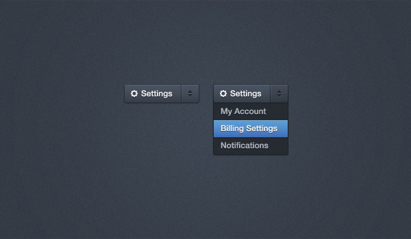
Images Can Be Used To Help The Visitors To Categorize For Themselves

Image Source : webuikits.com
A lot of organizations try to accommodate multiple competing images and messages on a single page alone. More often than not, such action has severely backfired, as the multiple animated banners make it impossible for the visitor to concentrate on one particular message. This might cause irritation, as a result of which the visitor will leave the website in search of another that is well-organized.
If the website serves multiple audiences, then it is better to design the home page that functions as a guide and ushers visitors to the particular category as per their requirement. This will help them find the content that is most relevant to their purpose of visiting the website.
The Images Used Should Focus On Improving Conversion Rates

Image Source : experienceadvertising.com
Images need to be incorporated in the layout of the design with much care, as they can be both attractive, and distracting as well. Graphics and pictures can engage visitors, or at other times, divert their attention from the call-to-action on the page. Hence the use of graphics and animation calls for extreme caution on the part of the designer.
If the designer is creative enough, then the call-to-action can be placed in the graphical framework itself, as is the case with Adobe. The end focus of any website is to improve the conversion rates, and hence the images should be implemented in the layout with that intent in mind.
The visual appeal of a website can be enhanced in many ways while maintaining its clean and organized look. Fancy images and graphics might just leave the visitor confused. The best designed websites are those whose layout is not visibly imposing, as visitors can easily navigate their way through the design to find the necessary information.

RELATED POST

It is hard to imagine a business firm not having a professional website online. However, that is what the reality...
READ MOREHosting a website involves one set of tasks. You need to set up the right design template, think about the...
READ MORE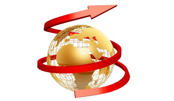
Table of Contents The first step towards higher profits is ANALYSISGeneration of sales and leads increasing revenuesExpansion in the online...
READ MOREPartners

Copyright © 1999-2026, B3net inc.