Understanding Responsive Web Design and its Features
September 25, 2012 | Sudeep Banerjee
Join Our Newsletter
Explore Our Solutions
From stunning websites to smart AI solutions and top-ranking SEO — we bring your vision to life.
Table of Contents
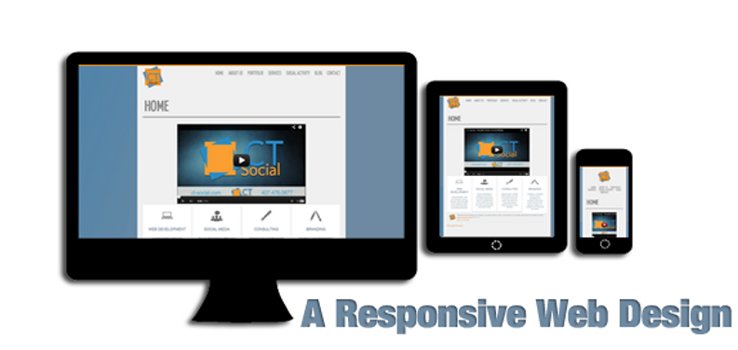
The term Responsive Design was first coined by Ethan Marcotte. The entire idea of Responsive designing is to create a website that works on the desktop as well as other devices such as Smartphones or Tablet PCs, wherein the layout would be changed automatically.

Image Source: www.abcsites.com
Why is Responsive Web Design Important?
With people accessing the Internet through an array of devices and browsers, they deserve a quality experience regardless of the size of their device’s display. It thus became the dire need of the web designers to design a website which provides the information to the users in varying screen sizes and resolutions. Responsive designing techniques were utilized by the web designers as a versatile solution to offer better user-experience to the Smartphone or mobile tablet users.
Responsive Web Design – The Features
Common features of responsive web designing are mentioned below:
Minimum Effort
Responsive Web Design minimizes the effort of the designers. The information in the site needs to be updated only once and it will appear similar in all versions of your website.
Enhanced User Experience
Responsive web design enhances the user-experience and entices a visitor with superb navigational tools and interactive user-interface and simplified and innovative designing elements. With the responsive web designing elements, you can easily browse through a website, regardless of the size of your device or the resolution it supports.
In Responsive design, the navigation is simplified, the text is reflowed, and the images are shrunk, or entirely hidden. The code needs to be written once, thus making the life of designers as well as vistors easy like never before!
If you wish to check out how the trend of responsive design is flaring mainstream, then you must take a look at the Boston Globe’s website. This site is the most popular recent examples and the site was developed, in coordination of Marcotte himself. While you resize your browser window, you can see the content reflowing and adjusting itself as per the browser’s size. Today, Google has also embraced responsive design, with a guide on one of its Webmaster blogs, and have brought in changes to the legibility in its Chromebook site.
RELATED POST

Table of Contents The plethora of marketing mediumsAn overview of the technologyAdvantages of implementing Website Browser Push Notification over other...
READ MORE
Table of Contents Responsive Web Design Can Make Life EasierNo Squeezing and Pinching the ScreenMaintain Single Set of ContentAnd then...
READ MORE
If you run Google ads to attract quick traffic, generate sign-ups, or increase sales, you must have come across the...
READ MOREBoost Your Revenue with AI-Powered
Digital Transformation
Serving Your Location
Explore
Copyright © 1999-2026, B3net inc.


