How Website Design Can Improve Lead Conversion
October 12, 2017 | Sudeep Banerjee
Your website design is as good as people perceive while interacting with it. However, from a commercial perspective, your website is as good as it delivers results for you i.e. conversions.
Not all good designs are great designs. There is a difference. Good design brings “wow” factor to web audience, but great design adds conversion strategy to it. A research by Stanford University says that around 46% people consider website’s design as a primary criterion to decide on the credibility of a business. A website that feels aesthetically pleasant as well as follows the web design principles for conversion optimization is a good bet.
Conversion-centered design removes psychological barriers between a website and its target audience and thus helps in decision making. Highest converting websites prioritize on user experience. A structured approach of web design helps you optimize SEO, SMM efforts and increase lead conversion rates.
In this post we will discuss what different you can do at your best and what best you can do differently to boost conversion rate of your website.
Update Your Perception of Web-Based Business
Many companies take their business website for granted. They test and run experiment on their website to improve design score, but the fact is that 61% of companies conduct less than five tests in a month. It is necessary that you are aware of the website dynamics and behavioral pattern of online audience. People take only 0 to 8 seconds of time to decide whether your website has compelling headline and action-oriented landing page. 96% of visitors coming to your website are not yet ready to buy. So how do you satiate them with an appealing design?
As per a study by Adobe, given 15 minutes of time to read and evaluate a page, two-third of people prefer skimming something beautifully designed than something looking ordinary.
So whether you are a web designer, or you hire a freelance designer or employ a consultant for the design service, you can’t help but learn web design principles and do whatever it takes. A good and effective design is a mandate.
In this post we will discuss on handful web design etiquettes to help you focus on conversion-centered design.
1. Make Your Business Objective Clear
Put it at first. If you have specific business goals, let them appear on the homepage, especially within above-the-fold content area. Your customers want to know what you sell. Adding a relevant graphic / banner or a quick video to the top of the page can do the job. Include a headline in larger text for providing key information points. Support your business statement with a clear call-to-action.
2. Use Golden Ratio
It’s interesting. If you divide a website’s visible area in proportions as per the golden ratio (1:1.618), it becomes aesthetically pleasant. This rule of proportions has been used by Twitter. For example, if the width of your website is 1024px, the main content area should be 633 pixels and sidebar 391px.
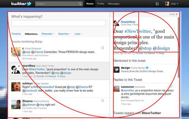
If the height of web page is 768px, you can again vertically divide it into 475px and 293px. You can further segment the smaller chunks in the sidebar as per golden ratio. This enhances positioning of key contents on your web page, resulting in better UI and smoother browsing experience.
3. Apply Hick’s Law
Present less number of choices to your users. The more you offer the less they interact with your website options. If your website provides too many options in the navigation bar, user will lose their interest and end up doing nothing.
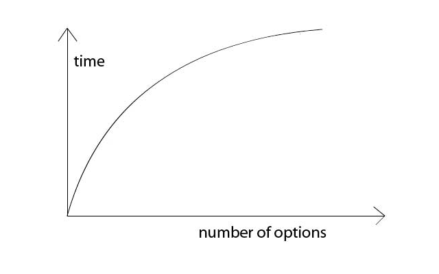
Instead, use your homepage as a gateway to welcome your visitors. Provide them with a single call-to-action in the above-the-fold content area. Minimize distractions keeping functionality intact on your homepage. Help users take a decision or action at the quickest time possible.
4. Apply Lead Magnet
Establish call-to-actions and test them in a regular interval until you find an optimum placement for them. Help users follow purchasing or information gathering steps. Some users are in a hurry to buy or inquire about your product. Some prefer researching about it before taking buying decision.
Ensure your website’s call-to-action buttons cater the both. For example, the former type of CTA button can be “Try this”, “Buy Now”, “Add to Cart”, “Add to Wish List”, “Call for Price” and so on. For the latter type, you can use “Download for Free”, “Register Now”, “Subscribe to Whitepaper” and so on. Add testimonials to your page. It adds to your credibility. Use faces to increase familiarity of your business. Make them appear on your blog, testimonials, case studies, white papers, opt-in pages, newsletters, and social media feeds.
5. Work on Button Size

Applying Fitt’s law to web design principles can further improve conversions for your website. As per the law, bigger objects are closer to us and they are easy to use. For certain applications, you may prefer to increase the size of a button to increase click-through-rate. But that’s not always true. Increasing the size of a tiny button by 20% may appear useful, but that is not applicable to a large-size object. Also focus on the frequency at which the button would appear while determining the size of it. You can increase size of a button that drives maximum attention and lead to conversion. For example, a “Submit” button may look bigger than “Reset” button since most of the visitors would click on the obvious button.
6. Communicate Visually
Use image in design. High quality stock photos are a good choice. Apply rule of thirds while defining positions of design components. Imagine an image is divided into nine equal parts with two equally spaced vertical and two horizontal lines. Now place the most important parts of your image along the lines and their intersections. Using large images draw attention quicker. They make your website appealing.
7. Abide by the Rule of Proximity

Don’t group multiple objects together so that they are not perceived as a single object. Again, in some cases such as navigation menu and footer, you may want them to be closely aligned to each other. Maintain white space or negative space so as to increase readability of a web page. Keep every component legible and scannable that easily comes through amidst other things.
8. Align Your Design to the “F” Pattern

People tend to skim a website from left to right starting from the top of a screen. As they scan downwards, the area of attention becomes narrower. Contents in the bottom right section of a page get minimum attention. This viewing pattern makes designers’ job easy as they can place headlines and key business information in the left-hand side of the page. For a blog, the right sidebar may contain sponsored ads, cookie policy, disclaimer or any low-priority information.
9. Let Color Scheme Convey the Message
Choose a color combination that creates an emotional and psychological appeal to your visitors. A good way to do that is through Adobe’s Color Wheel. First, select a few images that reflect your business. Upload them to Color Wheel. Once uploaded, the tool will automatically create a suitable color scheme for your website based on the colors of your selected images. You can further tweak the individual colors by moving the selection bar around.
Using color contrast to your advantage is also a good practice. Maintain readability of your body texts, headlines and lead-generating buttons. White background with black text gives the highest contrast. However, you can use different shades of blue as a background and apply yellow or orange color sparingly for CTA buttons. Here is a quick guide to selecting colors for your buttons.
Last, but definitely not the least, is the proper use of navigation links. Once you have analyzed the web design principles, the next step is to see what rules you are breaking during implementation and what you are not. You can further investigate and find tweaks for quick fixes. Stick to the basics and keep simplicity of design a topmost priority.
Want a design which can boost your website lead conversion? We are here to help you
CALL US at (714) 936-0208
or
[eva_button link=”https://www.b3net.com/contact.html” size=”medium” fa=”” fa_icon=”” bg_color=”#3c5ca4 ” text_color=”#ffffff ” target=”_self”]Contact us[/eva_button]

RELATED POST
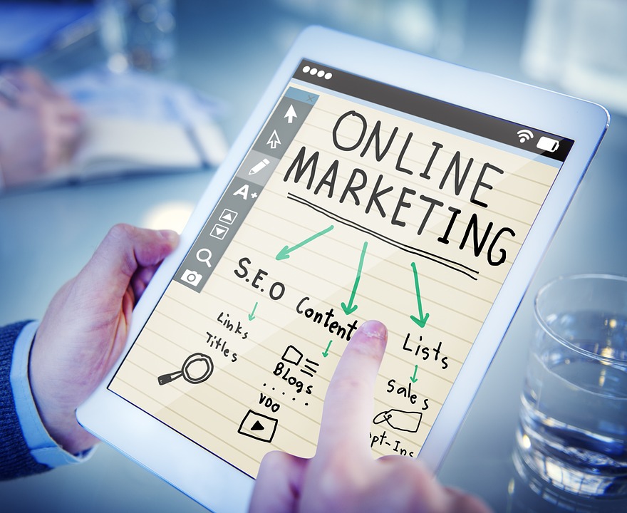
Table of Contents 10 Reasons Why You May Need Digital Marketing?Importance of Digital Marketing in Expanding a Business OnlineThe Final...
READ MORE
Our economy has been in turmoil for the past couple of years. The dark clouds looming over us now seems...
READ MORE
Table of Contents What is AI SEO?Why is AI SEO Important?5 Best Practices to Improve Your Website Ranking with AI...
READ MOREPartners
Copyright © 1999-2026, B3net inc.