Resurgence of Metro Style Designs – a Quick Glimpse at Some of the Popular Examples
October 9, 2013 | Sudeep Banerjee
Little did people know that the famous phrase ‘less is more’ will be taken up so seriously in the world of technology and gadgets because that has been the approach for mobile and web developers all across the globe. There was a time when people attempted in making all things fancy with the hope that it would attract customers and people all across. But this secret approach seems to have fallen flat on the face of the developers because users are no longer interested in fancy stuff and on the contrary they are looking for designs that are simple, soothes the eye and is most importantly effective with a high user value.
The popularity leading to new metro designs
Continuing with this approach let us now focus our attention on the Metro style design because that has created quite a buzz in the world of user interface. This design was initially used in Windows 7 but seeing its raging popularity it got incorporated in Windows 8 as well. The visual appeal is absolutely flat following the flat design trend with no gloss, shine, shadows or even an highlighted 3D effect. The popularity of Metro Style is all thanks to Microsoft and following in its footsteps there are several other designs that have been heavily inspired from it. So let us have a close look at some of the popular designs that draws its influences from Metro designs:
-
January Creative – this website powered by WordPress brings with it a number of ideas that they have taken from the various metro styles that are available. The catch of this website that manages to grab the eyeballs of users is the use of limited colors but these colors are absolutely in-sync with the flow of the style that this web page has.
-
One Touch – this design has the look of a template making the navigation very easy and free-flowing. The fact that it is free-flowing makes online interaction with friends easy and the credit should entirely go to the simplicity with which it has been designed. It is safe to say that the USP of this web design is its simplicity but the guarantee of high user experience.
-
Metro Twit – a design that has its own elegance making reading a sheer delight for readers. If assuring quality reading experience is the selling point then this design is bound to attract online readers from all across and that is exactly what we can see is happening. The clean user interface is visually appealing as well as subtle but is not in your face.
-
Windows Phone – the basic reason for metro designs to have gained so much popularity is because of its extensive use of bright colors without hitting your eyes. Even in case of Windows phone the focus is to follow flat design and make it appealing just with the use of colors. So splash in the bright hues and kiss good bye to the 3D effects and all things glossy and shiny.
These are some of the most popular designs that have caught the attention of users for its effective functioning but it continues to remain appealing and that is the catch that metro designs focus on. So when are you trying out for it?

RELATED POST

We often talk of website designing trends and practices that should be avoided. In this blog post, we will discuss...
READ MORE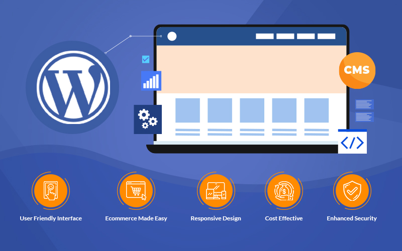
Whether you run a small or midsize business, you can no longer rely solely on sales generated from physical stores....
READ MORE
Digital marketing sits on the top of every company’s bucket list if they are trying to establish their footing in...
READ MOREPartners


Copyright © 1999-2026, B3net inc.